Support us, you beautiful Tour de France fan 🚴🏽♂️🏆🇫🇷
The deal: you access this new Tour de France logo PNG.
Now do your part and tip us now! 👍🏼
Your support helps keep this logo up to date.
Show us your love! 💙⚪️❤️
THE NEW TOUR DE FRANCE LOGO PNG IN 2026
The new Tour de France logo PNG in 2026.
The latest Tour de France logo PNG large and small pixel HD sizes.
The current official Tour de France logo PNG design aesthetics.
Brought to you by Mau, a Tour de France fan, logo designer and bicycle racing marketer at eDigital.
THE NEW TOUR DE FRANCE LOGO PNG IN 2026
Before you start using this latest Tour de France logo PNG, let me tell you something you might find hard to admit:
Social media platforms are mugging you in broad daylight 🔫 while you thank them for the privilege.
Their algorithms show your “viral” content to roughly the same audience who’d notice if you screamed into your office printer: Amy from the design team, and she does not even know your name. 😵
You own nothing 🤡 on your social media accounts.
You’re renting followers from landlords who charge you extra just to talk to your own audience.
It’s like building a mansion on rented land: expensive, temporary, and the landlord can bulldoze it whenever they update their “community guidelines”. 🏠💥
Meanwhile, social media owners are swimming in pools filled with your ad spend. 🏊♂️💰
Your current situation:
❌ Zero follower data ownership 📊❌
❌ Organic reach = no-one watching! 🕵️♂️
❌ Ad costs rising faster than your therapy bills 📈💀
❌ Followers “export” button? Pure fantasy 🦄
The intervention your marketing needs:
✅ Stop being social media’s favourite ATM 🏧❌
✅ Own your audience (revolutionary concept!) 👑
✅ Lower your customer acquisition costs 💰
✅ Build marketing systems that you own and control 🤖❤️
Throwing money at social ads hoping for results is expensive self-harm with the worse ROI. 🔥
Ready to break up with social media algorithmic abuse?
Book a strategy session and learn to build marketing that works for you, not against your bank account. 🚀
Stop renting your success. Start owning it.
Let’s craft the best digital marketing plan and social media strategy that boosts sales and customer lifetime value
Sports marketers working for some of the most popular professional bicycle races are using this most up-to-date Tour de France logo PNG file.
Trending this week: the world’s top 25 most-followed TikTok celebrities
THE NEW TOUR DE FRANCE LOGO PNG TRANSPARENT IN 2026
The new Tour de France logo is not as minimalistic as the new Apple logo but can easily compete with some of the world’s most popular logos, even with the most recognised top 25 luxury high fashion brands’ logos.
SMALL SIZE – NEW TOUR DE FRANCE LOGO PNG
The current official Tour de France logo PNG small size full gradient colour circle on a transparent background.
Steps:
- Right click on the small size Tour de France logo PNG
- Select “Save as”
- Viola!
- You now have the new Tour de France logo PNG small size
Tour de France attracts a massive global audience, making it one of the world’s most-watched road cycling competitions and marketers love it as it brings great opportunities for boosting brand awareness and brand preference.
This professional bicycle race competition’s global media coverage ensures that millions of fans around the world tune in to watch it and become aware of its sponsor brands.
Sports marketers checked out some of the world’s top 25 sports athletes on Instagram
Who designed the new Tour de France logo PNG?
This new Tour de France logo PNG was designed by French designer Joel Guenoun.
The top 10 most important design elements of the new Tour de France logo
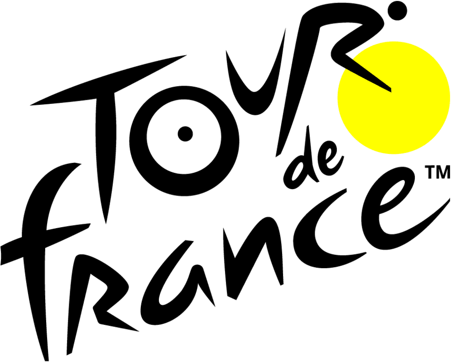
1. Hidden cyclist motif: the logo cleverly incorporates a hidden cyclist within the wordmark.
- The “R” forms the rider’s body.
- The “O” and “U” form the wheels of a bicycle.
- The yellow dot (above the “R”) represents the rider’s head.
2. Yellow dot as the sun and Maillot Jaune: the yellow circle in the logo represents the sun, symbolising summer and the race’s timing. The maillot jaune (yellow jersey), which is worn by the race leader.
3. Handwritten, energetic typography: The custom typeface mimics a handwritten, brush-like style, conveying dynamism, movement, athletic intensity
4. Forward tilt / diagonal energy: the angle of the letters creates a sense of forward motion, mimicking speed and progress, uphill cycling gradients
5. Black and yellow colour scheme: black conveys strength and tradition. Yellow links to the iconic jersey and energy of the race. The colour contrast ensures high visibility and impact.
6. Minimalistic and scalable: designed to be clean, modern, and adaptable across platforms, from jerseys to app icons. It works at small sizes without losing the cyclist motif.
7. Modernised without losing heritage: while updated for a digital era, the logo maintains a strong connection to its previous iterations.
8. Emotional and cultural relevance: the new Tour de France logo PNG captures French identity, tradition, and passion through its expressive design and playful elements.
9. Visual hierarchy and emphasis on “Tour”: the word “Tour” is given prominence in size and style, anchoring the identity around the iconic event title.
10. Versatile use: the logo is designed to work in full colour, monochrome or inverted versions. Print, digital, TV, and merchandise formats.
Some of the world’s top celebrities, influencers, creators and brands seen featured with the new Tour de France logo include:
Just in: the most popular 25 sports hashtags on TikTok
Popular read: the best logo design software
Is your marketing generating sales and profit for your business?
You can start a successful social media strategy with clear and defined objectives that will make you grow your business.
A well-crafted marketing strategy will:
✔︎ Optimise your valuable time
✔︎ Make you produce far less but better quality marketing campaign content
✔︎ It will increase sales, profit and brand equity
If you believe you have a creative, passionate and curious mind and you are seriously ready to grow your business, I invite you to craft a successful social media strategy today!
I guarantee you will never go back to the same old way you were doing tennis marketing.
MEDIUM SIZE – NEW TOUR DE FRANCE LOGO PNG
The current official Tour de France logo PNG medium size on a transparent background.
Steps:
- Right click on the medium size Tour de France logo PNG
- Select “Save as”
- Viola!
- You now have the new Tour de France logo PNG medium size
Sports marketers are checking out some of the world’s top 25 most popular sports athletes on Instagram
What was the inspiration behind the new Tour de France logo PNG?
Joel Guenoun‘s inspiration for the current Tour de France logo PNG stemmed from a desire to capture the spirit and essence of the race through a clever and dynamic visual trick.
Key elements of his inspiration included:
- The cyclist within the wordmark: this is the most brilliant and recognised aspect. Guenoun cleverly used the letters of “Tour” to form a cyclist on a bike. the “O” becomes the rear wheel, the “U” forms the seat and part of the rider’s body, and the “R” completes the rider. This integration visually represents the core activity of the race directly within its name.
- The Yellow circle / sun / yellow jersey: the prominent yellow circle serves multiple purposes. It functions as the front wheel of the cyclist, adding to the hidden image. More importantly, it directly symbolises the iconic yellow jersey (Maillot Jaune) worn by the race leader, which is the ultimate prize and symbol of success in the Tour. Additionally, it can evoke the summer sun, reflecting the time of year the race takes place and the gruelling conditions.
- French flair and handwriting style: the logo features a playful, brush-script typeface. This handwritten style gives it a very French, artistic feel, tying the logo subtly to the race’s origin and national identity, evoking a sense of heritage and tradition.
- Dynamic motion and simplicity: Guenoun aimed for a design that conveyed speed and motion while remaining simple and elegant. The subtle lean of the “R” and the overall flow of the wordmark contribute to this sense of movement.
In essence, Guenoun‘s inspiration was to create a logo that was not just a logo, but a visual narrative that instantly communicated what the Tour de France is about: cycling hard, the iconic yellow jersey, and its French heritage, all within a single, memorable logo design.
Tour de France logo PNG colours
The latest Tour de France logo palette features:
- Black
- Yellow
⚡️ Trending this week: the world’s top 25 most popular TikTok influencers
LARGE SIZE – NEW TOUR DE FRANCE LOGO PNG
The current official Tour de France logo PNG large size full gradient colour circle on a transparent background.
Steps:
- Right click on the large size Tour de France logo PNG
- Select “Save as”
- Viola!
- You now have the new Tour de France logo PNG large size
Just updated: the top 25 sports hashtags on TikTok
🎬 Conclusion
The new Tour de France’s logo is actually a masterclass in branding.
While other organisations constantly rebrand, Tour de France has maintained recognition and trust through visual stability.
Final note📝: Are your marketing costs through the roof? 🚀💸
If your customer acquisition costs are climbing faster than a startup founder’s ego 📈😎 (post‑IPO champagne still in hand 🍾), and you’re hooked on paid ads like a reality TV star or a Tinder date who keeps accepting your dinner invites 🍝🍷 but never calls you back 📵💔…
If that sounds like you 👀👂🏼, you should definitely contact us 🧠💬📞
Our exclusive digital marketing strategy workshops will mercilessly dissect your marketing🔥💀, expose all the weak spots and show you how to ditch the algorithm chokehold to build a marketing engine you actually own. 🔧🚀
We’ll shake up your team’s thinking 🧠⚡, drop fresh ideas 💡🍉, and turn your marketing from “meh” 😐 to a money-making machine. 🤑💸
Ready to stop burning cash and start making it? 💥💰
Hit us up! 📲📞
We offer:
✔ Digital Marketing Strategy. Because hope is not a plan 🙃
✔ Online Ads (Google, Social, Remarketing). The art of spending money wisely for once 🎯
✔ Social Media Marketing Training. So you stop posting into the void 🕳️📉
✔ SEO Strategy & Execution. Because if Google doesn’t know you exist, do you even? 🤷♂️🔍
✔ Influencer & Celebrity Marketing. Get people with clout to talk about you 💅📢
✔ Branding & Logo Design. So you don’t look like a dodgy side hustle 💼🚫
✔ Consumer Giveaways & Competitions. Because people will do anything for free stuff 🎁
✔ Email Marketing & Drip Sequences. Slide into inboxes the right way 💌😏
✔ Conversion Rate Optimisation. Turn window shoppers into actual buyers 🛒➡️💳
Ready to start marketing like a boss? Let’s talk 📞🤝
THE LATEST TOUR DE FRANCE LOGO PNG IN 2026
was brought to you by Mau

Mau’s a Tour de France fan, logo designer and bicycle racing marketer who delivers killer digital marketing strategy workshops and best social media training so good, even your grandma will get it.
5k+ smart marketers who love stealing good ideas receive Mau’s weekly email, while others tired of guessing use Mau’s Digital Marketing Plan and Social Media Plan templates.
Mau’s “Escaping Capitalism” trip 🌎 ✈️ is leaving questionable life choices on TikTok & YouTube